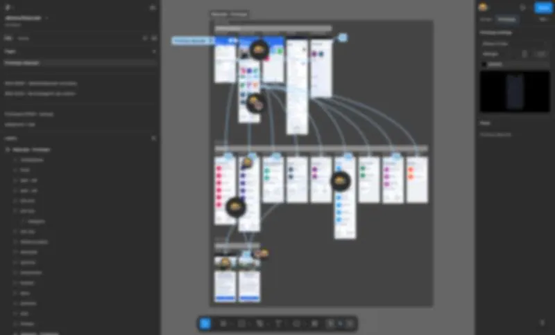
 NDA
NDADigital product developmentVývoj digitálnych produktov
I design digital products where clarity and trust are non-negotiable. The flagship is George, the digital banking platform of Slovenská sporiteľňa, where I have spent years shaping flows that millions of people use without ever thinking about the design.Navrhujem digitálne produkty tam, kde jasnosť a dôvera nie sú na diskusiu. Vlajková loď je George, digitálna banková platforma Slovenskej sporiteľne, kde roky formujem toky, ktoré milióny ľudí používajú bez toho, aby nad dizajnom vôbec premýšľali.
The contextVýchodisko
Banking is the one product people open in a hurry, often stressed, sometimes at midnight. Every extra tap is a moment for doubt to creep in. The brief was never "make it pretty", it was "make it so obvious that nobody has to think". In a regulated environment that means designing inside guardrails: accessibility, security, legal copy that cannot move, and flows that must survive an audit.Banka je produkt, ktorý ľudia otvárajú v zhone, často v strese, občas o polnoci. Každý zbytočný klik je priestor, kde sa vkradne pochybnosť. Zadanie nikdy neznelo "sprav to pekné", ale "sprav to tak samozrejmé, aby nikto nemusel rozmýšľať". V regulovanom prostredí to znamená navrhovať v mantineloch: prístupnosť, bezpečnosť, právne texty, ktoré sa nesmú hnúť, a toky, ktoré prežijú audit.
How I work on itAko na tom pracujem
I start from the moment of intent, not the screen. Before drawing a single component I map what the person actually wants to achieve and what they are afraid of. Then we cut. A screen that survives review has earned every element on it. I work in short iteration cycles with product managers and engineering, running research and testing high-fidelity prototypes on real people, then watching exactly where a finger hesitates, because hesitation is data. Nothing ships on a hunch.Začínam od momentu zámeru, nie od obrazovky. Skôr než nakreslím jediný komponent, si zmapujem, čo chce človek reálne dosiahnuť a čoho sa bojí. Potom škrtáme. Obrazovka, ktorá prežije kontrolu, si každý prvok zaslúžila. Pracujem v krátkych iteračných cykloch s produktovými manažérmi a inžinierstvom, robím výskum a testujem high-fidelity prototypy na skutočných ľuďoch a sledujem presne, kde zaváha prst, pretože zaváhanie sú dáta. Nič sa nenasadzuje na pocit.
The craft underneathRemeslo pod povrchom
The invisible work is the design system: one language of components, states and rules that lets dozens of people ship consistently without a designer standing over every screen. It is the difference between a product that feels like one mind made it and one that feels stitched together. Research, wireframes, high-fidelity prototypes, handoff to engineering, then straight back to research.Neviditeľná práca je dizajn systém: jeden jazyk komponentov, stavov a pravidiel, vďaka ktorému desiatky ľudí dodávajú konzistentne bez toho, aby dizajnér stál nad každou obrazovkou. Je to rozdiel medzi produktom, ktorý pôsobí, akoby ho robila jedna myseľ, a tým, ktorý pôsobí zošívane. Výskum, wireframy, high-fidelity prototypy, handoff pre vývoj a rovno späť k výskumu.
The best banking interface is the one you forget the second you close it.Najlepšie bankové rozhranie je to, na ktoré zabudneš v sekunde, keď ho zavrieš.
What I take from itČo si z toho beriem
Constraints are not the enemy of good design, they are the brief. When you cannot rely on decoration, you are forced to earn clarity. That banking-grade discipline is what I now bring to every product, regulated or not.Obmedzenia nie sú nepriateľom dobrého dizajnu, sú zadaním. Keď sa nemôžeš oprieť o dekoráciu, si nútený si jasnosť zaslúžiť. Túto banking-grade disciplínu teraz prinášam do každého produktu, regulovaného či nie.
UX/UIBankingDesign systemsPrototypingResearchAccessibility
Work under NDA. No visuals shown, happy to walk through the specifics in a conversation.Práca pod NDA. Bez vizuálov, väčší detail rád preberiem osobne.
 Top 1 Google
Websites and brand growthWeby a rast značky
A website brings people in. A brand makes them remember. Social and content keep them coming back. I do the whole loop as one service, from a blank page to the top of Google and beyond. Strategy first, then craft, then measurement.Web privedie ľudí. Značka spôsobí, že si ťa zapamätajú. Social a obsah spôsobia, že sa vracajú. Robím celú túto slučku ako jednu službu, od prázdnej strany po prvé miesto v Google a ďalej. Najprv stratégia, potom remeslo, potom meranie.
Case 1 · Upratovanie Liptov, a website that ranksPrípad 1 · Upratovanie Liptov, web, ktorý rankuje
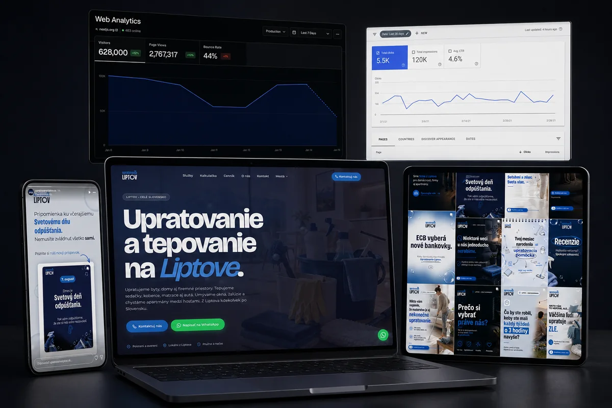
A small cleaning company from Liptov with a phone that rang thanks to word of mouth and nothing online. In a local service, trust decides everything, so the site stands on concreteness: real photos, a name and a face, transparent pricing and an interactive calculator. The sharpest decision was what we refused to chase, distant cities where a "LIPTOV" brand would look untrustworthy. Strategy is not only what you do, it is what you deliberately leave out.Malá upratovacia firma z Liptova s telefónom, ktorý zvonil vďaka odporúčaniam, a online s ničím. Pri lokálnej službe rozhoduje dôvera, preto web stojí na konkrétnosti: reálne fotky, meno a tvár, transparentný cenník a interaktívna kalkulačka. Najostrejšie rozhodnutie bolo to, čo sme odmietli naháňať, vzdialené mestá, kde by značka s „LIPTOV" pôsobila nedôveryhodne. Stratégia nie je len o tom, čo robíš, ale aj o tom, čo vedome vynecháš.
Technically: structured data, Open Graph, a Web3Forms contact form, and a performance refactor that took the page from 780 KB to 46 KB, about 94 percent lighter. Then genuinely different city pages, not doorway templates. The result: position one to two on Google for the main local query, with inquiries arriving straight from the form, and every next decision driven by real Search Console data.Technicky: štruktúrované dáta, Open Graph, formulár cez Web3Forms a výkonnostný refactor, ktorý stránku zmenšil z 780 KB na 46 KB, teda o 94 %. Potom naozaj odlišné mestské stránky, nie doorway šablóny. Výsledok: pozícia jeden až dva v Google pre hlavný lokálny dopyt, s dopytmi priamo z formulára a každým ďalším rozhodnutím poháňaným reálnymi dátami zo Search Console.
Case 2 · FIXOR, a brand from a blank pagePrípad 2 · FIXOR, značka z prázdnej strany
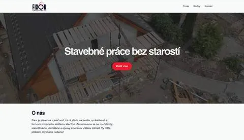
FIXOR came to me as a name and an ambition and left as a full visual world: logo system, website, business cards and print. A company with no visual language is invisible in a crowded market, no matter how good the work is. So the task was a voice that stays the same whether you meet it on a business card, a van or a screen.FIXOR prišiel ako názov a ambícia a odišiel ako kompletný vizuálny svet: logo systém, web, vizitky a tlačoviny. Firma bez vizuálneho jazyka je na preplnenom trhu neviditeľná, nech je práca akokoľvek dobrá. Úlohou bol hlas, ktorý znie rovnako, či ho stretneš na vizitke, dodávke alebo na obrazovke.
Identity first, applications second. I set the core, then pressure-tested it across every touchpoint the company actually uses. A mark that works only in the ideal case is not an identity, it is a poster. The brandbook exists so the brand survives me, so anyone can extend it without breaking it.Najprv identita, potom aplikácie. Nastavil som jadro a potom ho vytlačil naprieč každým touchpointom, ktorý firma reálne používa. Značka, ktorá funguje len v ideálnom prípade, nie je identita, je to plagát. Brandbook existuje preto, aby značka prežila aj bezo mňa.
Beyond launch · social and contentPo launchi · social a obsah
A launched site and a finished logo are the start line, not the finish. That is why I also run social and content: a steady stream of posts, visuals and video that keeps the brand alive between big moments. Same visual language as the website and the identity, so every post compounds the one before it instead of resetting it. Full service means the client has one partner for the whole thing, not five vendors who never talk to each other.Nasadený web a hotové logo sú štartová čiara, nie cieľ. Preto robím aj social a obsah: stály prúd príspevkov, vizuálov a videa, ktorý drží značku pri živote medzi veľkými momentmi. Rovnaký vizuálny jazyk ako web a identita, takže každý príspevok stavia na predošlom, namiesto toho aby ho resetoval. Full service znamená, že klient má jedného partnera na celok, nie päť dodávateľov, ktorí sa navzájom nerozprávajú.
A website earns the click. A brand is what makes them stay.Web si získa klik. Značka je to, čo spôsobí, že zostanú.
What I take from itČo si z toho beriem
A site without a brand is a leaflet. A brand without a site is a secret. Together they compound: the website turns visibility into inquiries, the brand turns inquiries into memory. Both are built the same way, with strategy, craft and honest measurement.Web bez značky je leták. Značka bez webu je tajomstvo. Spolu sa násobia: web mení viditeľnosť na dopyty, značka mení dopyty na zapamätateľnosť. Oboje sa stavia rovnako, so stratégiou, remeslom a čestným meraním.
WebLocal SEOBrandIdentitySocialContentPerformance
 0 → 100K+
Digital content creationTvorba digitálneho obsahu
I don't just design channels, I run them end to end. Three very different rooms, one method, to show the range: my own show, a niche brand grown from zero, and a podcast made with clients on the other side of the Atlantic.Kanály nielen navrhujem, ja ich aj rozbieham a vediem. Tri veľmi odlišné miestnosti, jedna metóda, aby bolo vidno rozsah: moja vlastná relácia, niche značka vyrastená z nuly a podcast robený s klientmi z druhej strany Atlantiku.
Case 1 · V Centre Zážitku, my own showPrípad 1 · V Centre Zážitku, moja vlastná relácia
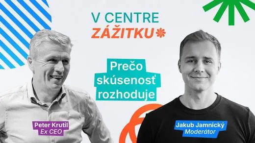
The proof that I can start and run a format solo. A podcast about customer experience, spanning UX, UI, CX, BX and EX, with guests who have led major brands. I host, produce, run the technical setup and design the visual format, so the whole thing speaks with one voice, from the questions to the thumbnail.Dôkaz, že formát viem sám rozbehnúť aj viesť. Podcast o klientskom zážitku naprieč UX, UI, CX, BX a EX, s hosťami, ktorí viedli významné značky. Moderujem, produkujem, robím techniku aj dizajn vizuálneho formátu, takže celok hovorí jedným hlasom, od otázok po náhľad.
Case 2 · Quantpedia, capturing a nichePrípad 2 · Quantpedia, ako zachytiť niche
Quantitative finance is not a topic you go viral with. The audience is small, sharp and allergic to fluff. Since 2020 I have led the creative: brand, the Quantpedia Awards, the YouTube channel and content strategy. Consistency beats intensity, and the payoff is real: from zero to more than 100 000 views in an audience most creators never touch, attention that turns into product interest and sales.Kvantitatívne financie nie sú téma, s ktorou sa staneš viral. Publikum je malé, ostré a alergické na vatu. Od roku 2020 vediem kreatívu: brand, Quantpedia Awards, YouTube kanál a content stratégiu. Konzistencia poráža intenzitu a výsledok je reálny: z nuly na viac ako 100 000 videní v publiku, ku ktorému sa väčšina tvorcov nikdy nedostane, pozornosť, ktorá sa mení na záujem o produkt a predaje.
Case 3 · QuantBeats, working with US clientsPrípad 3 · QuantBeats, práca s klientmi z USA
A podcast about web design, post-production, content and promo, produced in collaboration with American clients. Same discipline as any channel I build, now across time zones and a market with very high standards. It is the proof that the method travels.Podcast o web dizajne, postprodukcii, obsahu a promo, robený v spolupráci s americkými klientmi. Rovnaká disciplína ako pri každom kanáli, ktorý staviam, teraz naprieč časovými pásmami a trhom s veľmi vysokými nárokmi. Dôkaz, že tá metóda cestuje.
Reach is rented. A format people trust is owned.Dosah si prenajímaš. Formát, ktorému ľudia veria, vlastníš.
What I take from itČo si z toho beriem
A channel is a product with a deadline. Whether it is my own idea, a niche brand or a client on another continent, the same discipline builds an audience that stays: know the person, cut the noise, repeat the signal.Kanál je produkt s termínom. Či je to môj vlastný nápad, niche značka alebo klient na inom kontinente, tá istá disciplína buduje publikum, ktoré zostane: poznaj človeka, odstráň šum, opakuj signál.
ContentYouTubePodcastPost-productionMotionHosting
One visual language for very different nightsJeden vizuálny jazyk pre veľmi odlišné večery
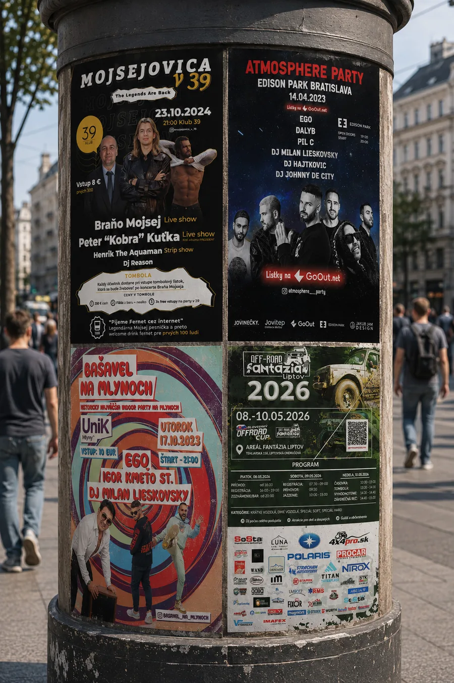
Posters and campaigns for events across Bratislava and Liptov: Atmosphere Party, Bašavel na Mlynoch, Mojsejovica and Off-Road Fantázia Liptov.Plagáty a kampane pre bratislavské aj liptovské eventy: Atmosphere Party, Bašavel na Mlynoch, Mojsejovica a Off-Road Fantázia Liptov.
The approachPrístup
Every event has its own energy, so each poster earns its own world, from a club night to an off-road weekend. The common thread is not a template but a way of thinking: clear hierarchy, a strong focal point, and a system that scales from a printed poster to a story on social. A poster has one job, to make you stop scrolling.Každý event má vlastnú energiu, takže každý plagát si zaslúži vlastný svet, od klubovej noci po off-road víkend. Spoločnou niťou nie je šablóna, ale spôsob myslenia: jasná hierarchia, silný ťažiskový bod a systém, ktorý funguje od tlačeného plagátu po story na sociálnych sieťach. Plagát má jednu úlohu, zastaviť ti prst pri scrollovaní.
In practice I work the whole campaign, not a single graphic: the key visual, the social cutdowns, the video promo and the print, all in one language so the event feels like a place before you even arrive. Names like Atmosphere Party, Bašavel na Mlynoch, Mojsejovica and Off-Road Fantázia Liptov share nothing but that discipline.V praxi robím celú kampaň, nie jednu grafiku: key visual, social cutdowny, video promo aj print, všetko v jednom jazyku, aby event pôsobil ako miesto ešte skôr, než tam prídeš. Mená ako Atmosphere Party, Bašavel na Mlynoch, Mojsejovica a Off-Road Fantázia Liptov nespája nič okrem tejto disciplíny.
PostersCampaignsSocialPrintVideo promo
Designing objects you actually holdDizajn vecí, ktoré naozaj držíš v ruke
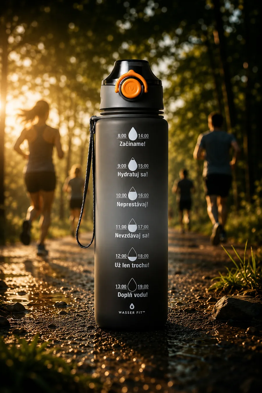
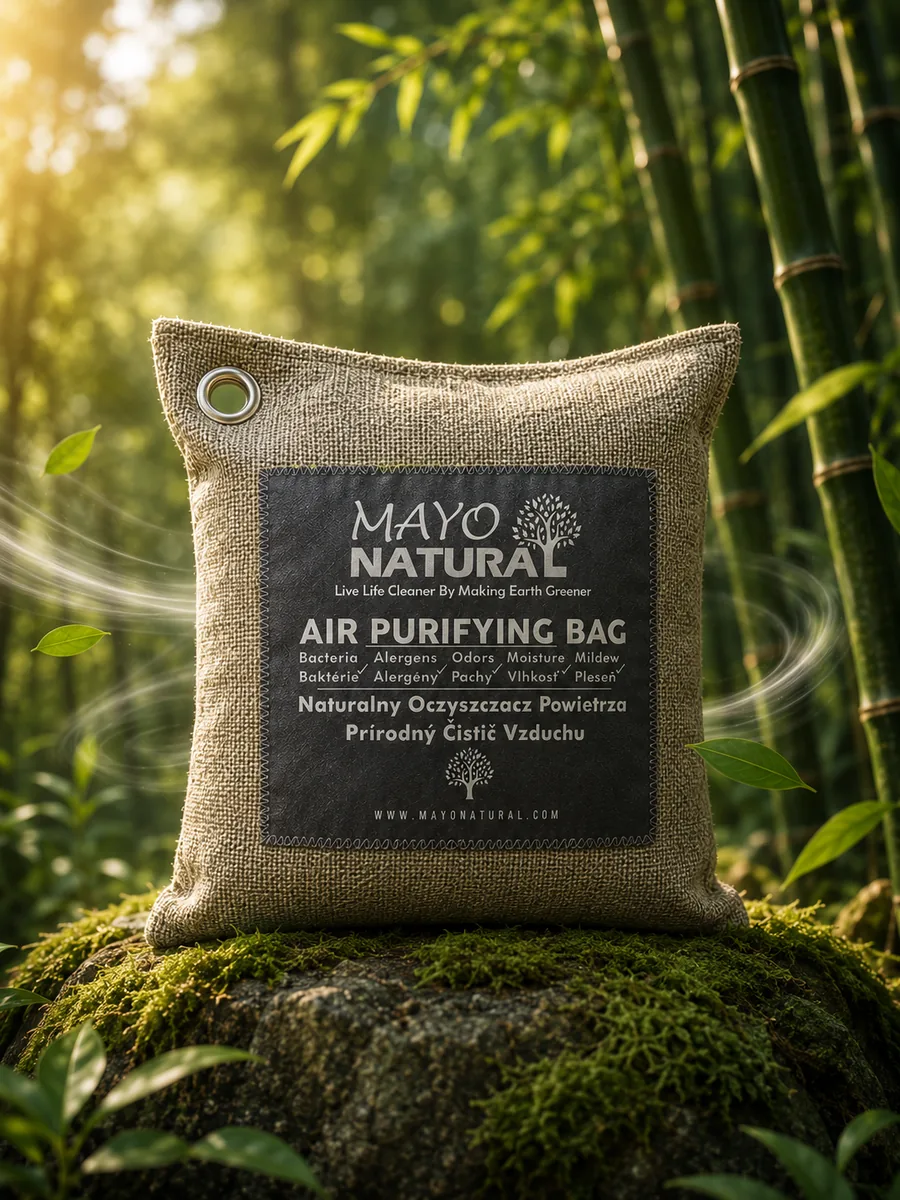
Selected work on physical products: Wasser Fit, a hydration bottle that keeps you motivated, and Mayo Natural, a bamboo air-purifying bag.Vybrané práce na fyzických produktoch: Wasser Fit, motivačná fľaška na hydratáciu, a Mayo Natural, bambusové vrecko čistiace vzduch.
The approachPrístup
A physical product has no undo. The label, the proportions and the way it reads on a shelf are the whole first impression, so every detail has to work in one shot. I designed for the moment of pickup: what the product promises, how it earns trust, and how it looks in the customer's hand and in a photo.Fyzický produkt nemá undo. Etiketa, proporcie a to, ako číta na poličke, sú celý prvý dojem, takže každý detail musí fungovať na prvý pokus. Navrhoval som moment vzatia do ruky: čo produkt sľubuje, ako si získava dôveru a ako vyzerá v ruke zákazníka aj na fotke.
ProductPackagingBrandArt direction
 JJ ↗ 2026